A purple, wavy line on a white background.
A smiling man wearing a backward baseball cap holding a purple patch with a logo and the words 'NOAH KAHAN' and 'GLASTONBURY '.
Close-up of a colorful embroidered patch with a camping tent, the words "NOAH KAHAN, GLASTONBURY, 23.10.23," placed on the ground among grass and a tree trunk.

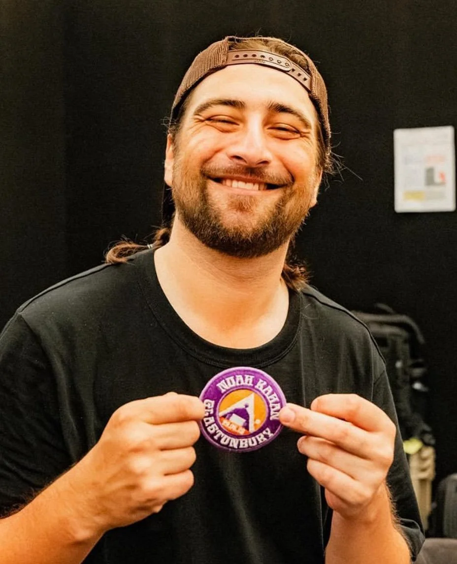
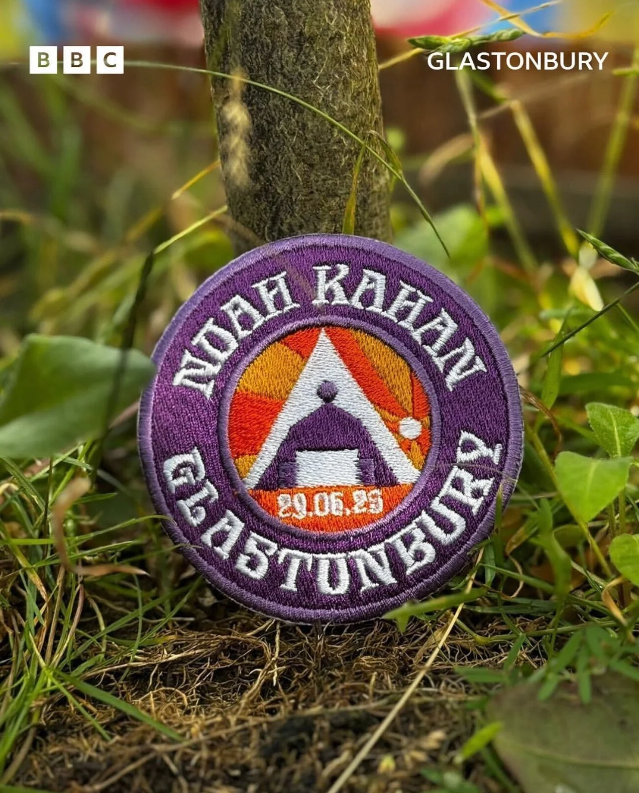
Noah Kahan’s Glastonbury Patch

I was commissioned by the BBC in collaboration with Glastonbury to design a custom patch for Noah Kahan. The patch was used across BBC Radio 1’s social media campaign for the event and shared by Noah Kahan himself.

Circular badge with purple border and background, featuring a white expedition tent, the date 29.06.25, and the words 'NOMAH KAHKI GIASONBAY' in white. The tent is set against a yellow and orange sunburst background.
Purple circular badge with white text around the edge reading 'NODAH KAH KAHAN GLASTONBURY.' Inside, there is a stylized white tent with a purple entrance, two purple speakers below, and the date '29.06.25' in orange at the bottom. The background features a sun with orange and yellow rays.
A circular badge with purple border featuring peace symbols and stylized text in a foreign language. The center shows an orange and yellow geometric pattern, with a white tent, speakers, and the date 29.06.25.
Circular logo with purple border, featuring a white tent, orange and purple details, a date 29.06.25, and text in a different language.

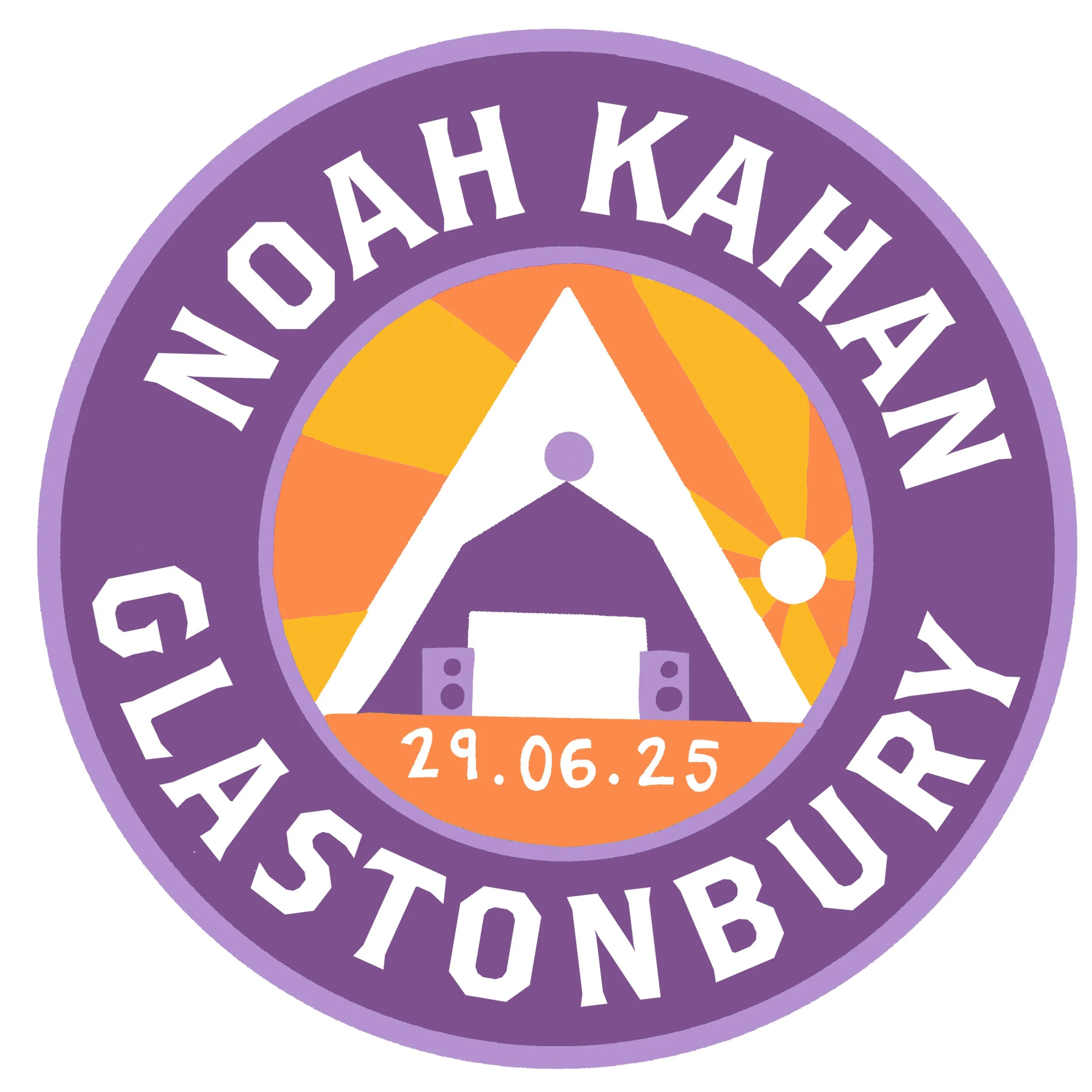
The brief for this project was to create a design that felt vintage inspired and in line with other badges Kahan had produced.

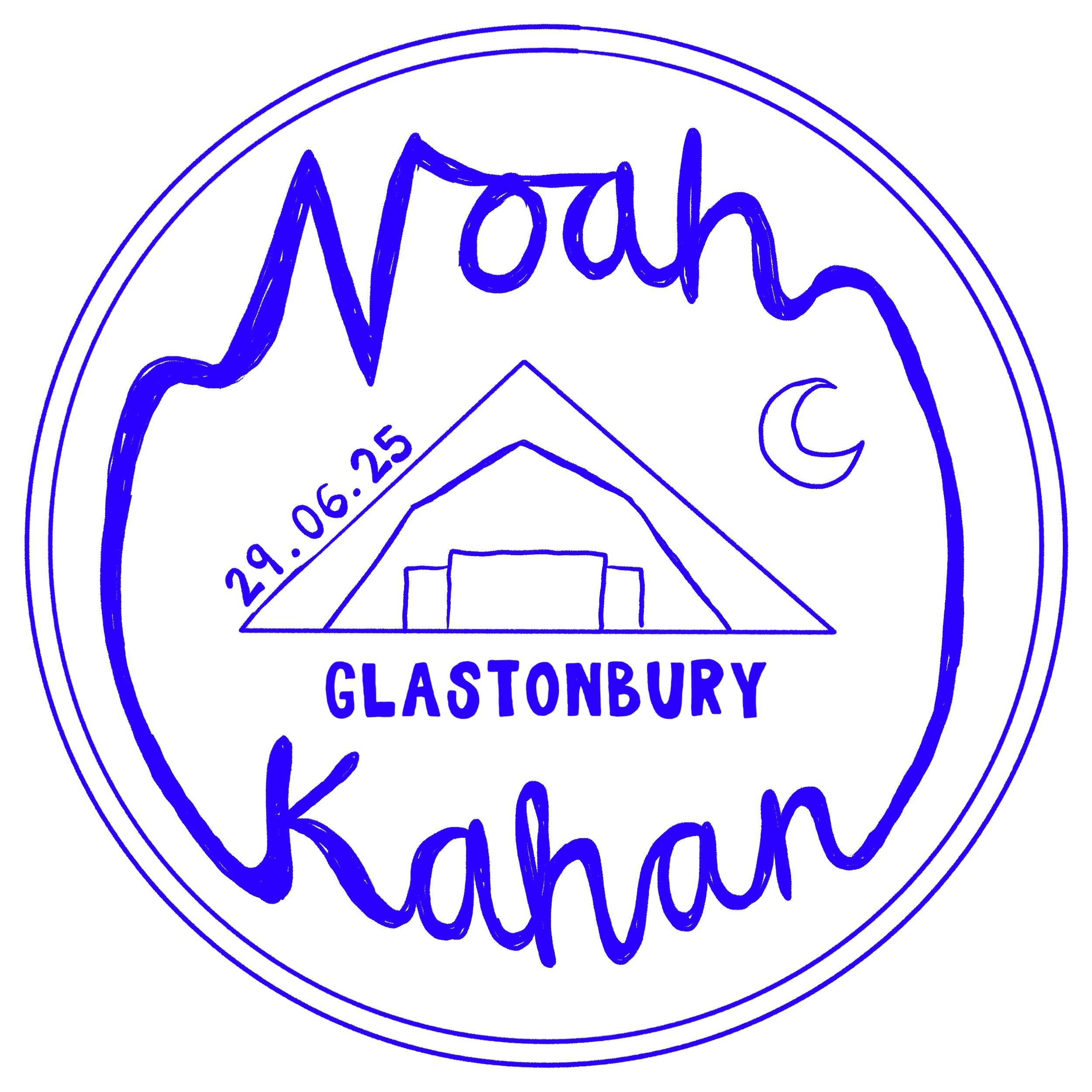
Above you can see the initial sketches I delivered to the client. At the stage I was taking a lot of inspiration for vintage camping badge and scouting patches. Through client feedback we developed a final design that moved towards the idea of a sunset rather than the initial proposed moon.

I enjoyed challenging myself in this project as I had a very limited colour palette to work with. Through this work I learnt how to create a more simplified design and create contrast with fewer colours.

This project also allowed me to experiment with graphic design and typography as the client wanted to move away from hand lettering. This process helped me to better understand how to create mood through type and how to balance bold text with my illustrative work.