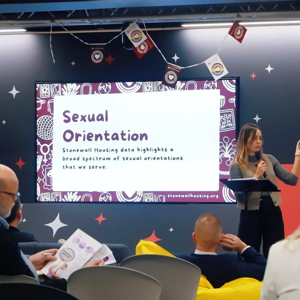
I have been working with Stonewall Housing since 2024, primarily using my illustrations to aid them in creating a brand identity. The illustrations serve as a way to make the brand feel more personal and to reflect the idea of queer home.


London Pride

For London Pride 2025 the ‘This is a Safe Space’ illustration that I created for Stonewall Housing’s branding was used as a key part of their pride campaign. The design was printed onto shirts and worn by members of staff, volunteers and celebrities throughout the pride march.

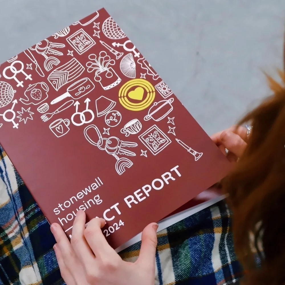

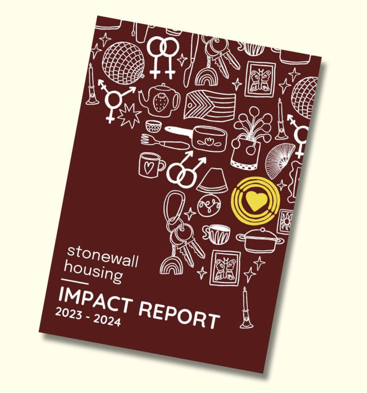


I created a repeat pattern for Stonewall housing to be used across their social media and marketing packs. This design was developed using research from the charities archive about queer homes and ideas from service users. All of the objects represent different ways people make their house feel like home.
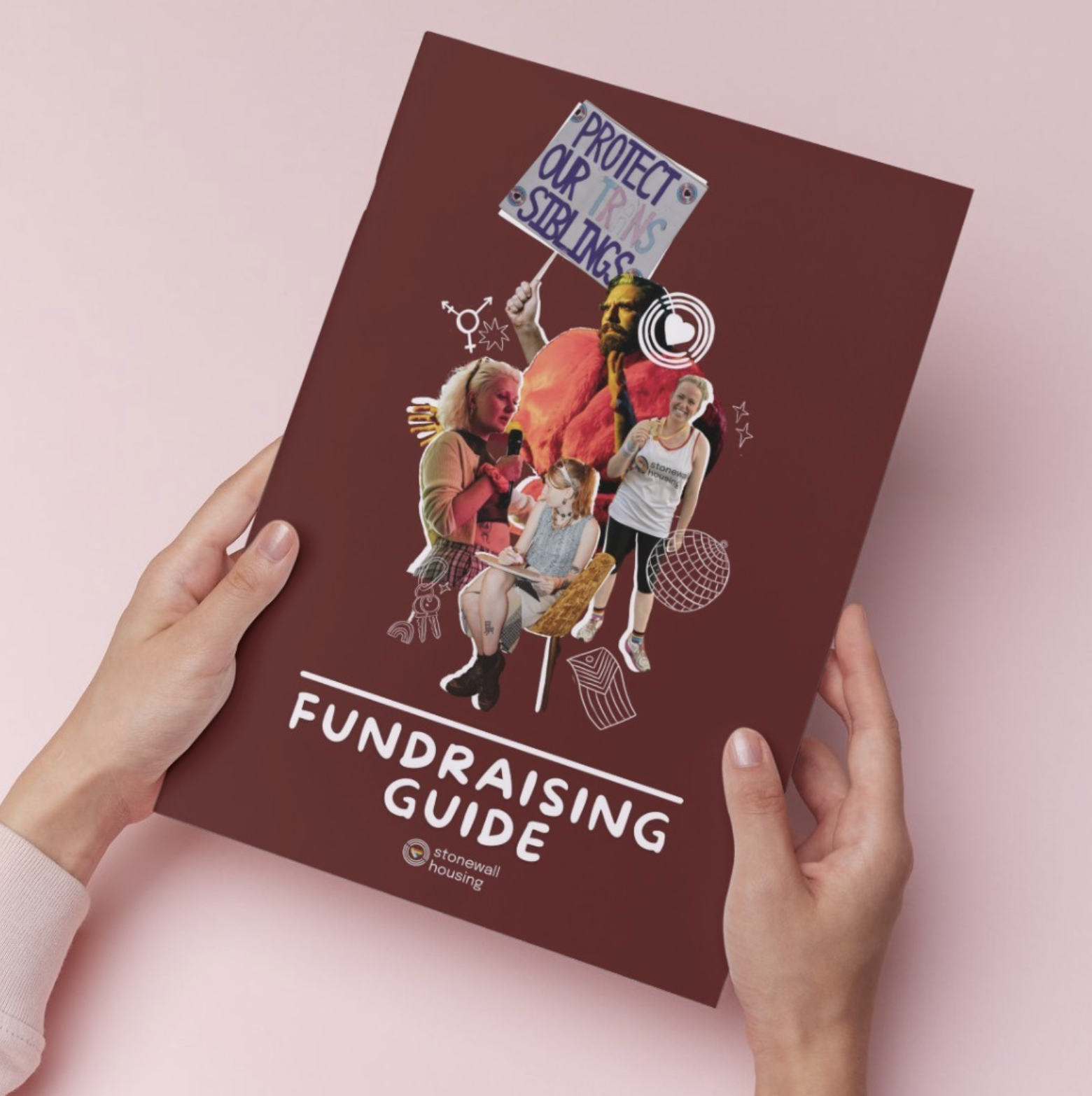
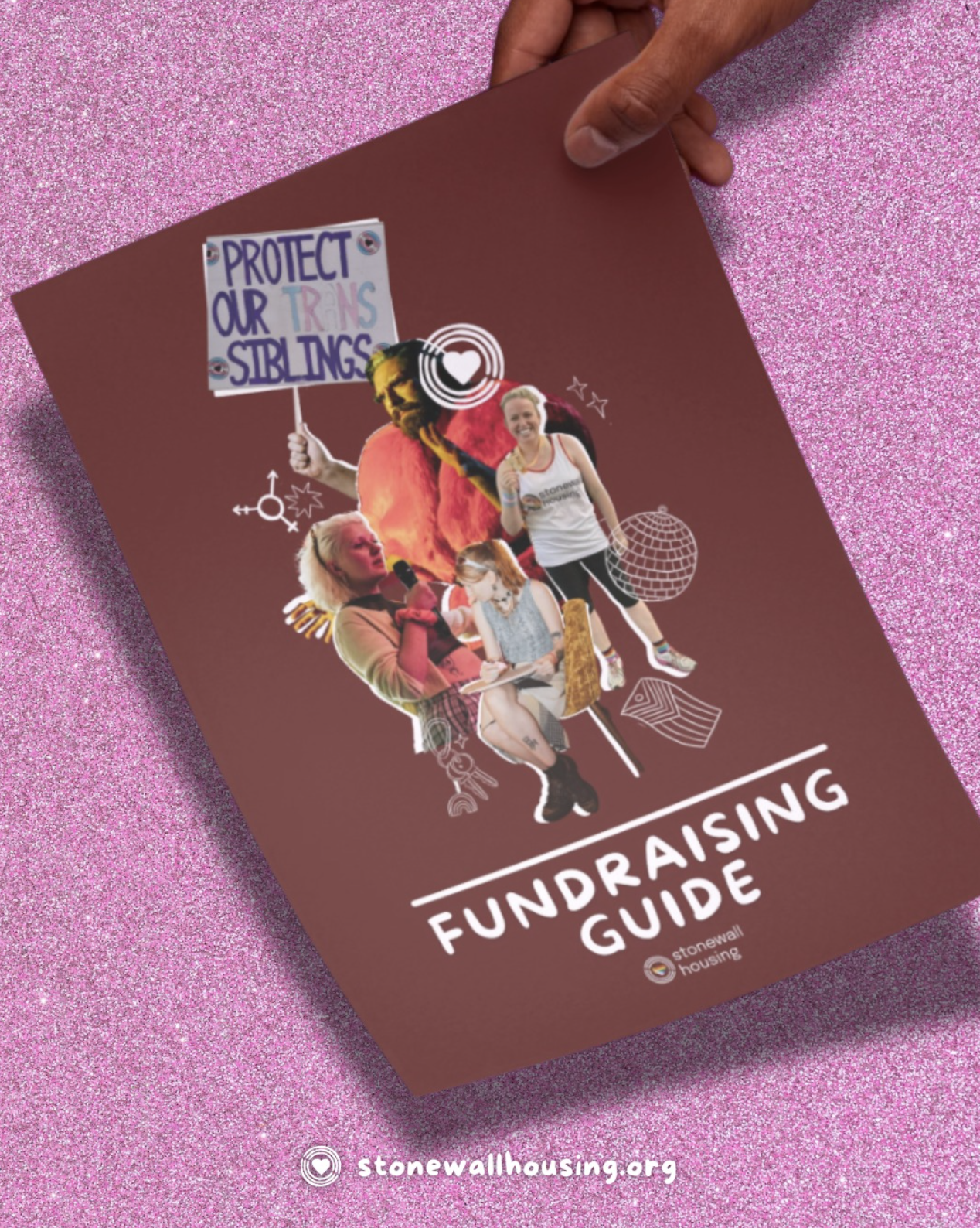
This illustration has been used by the team at Stonewall Housing to create a clear and more personal brand identity.

To find out more about the development of this project you can watch the video I created which documents the process from beginning to end. The video shows the sketchbooking process, response to client feedback and finalising the overall design.